

Alarm Count
Alarm Count component
Section titled “Alarm Count component”
The alarm count shows how many alarms are active, as one badge per priority. It answers “how bad is it”, where the Alarm Indicator answers “is anything wrong”.
Features
Section titled “Features”Configuration
Section titled “Configuration”Show total - adds a badge with the total across all priorities.
Compact mode - a denser layout, for tight spaces.
Orientation - lays the badges out Horizontal or Vertical.
Labels
Section titled “Labels”Each badge has its own label: Critical label, High label, Medium label, Low label and Total label. Changing a label only changes the text on the badge - it does not change which alarms are counted.
Alarm filter
Section titled “Alarm filter”Every alarm component shares these three properties. They decide which alarms this component shows; they never change the alarms themselves. An empty value means “show all”.
Areas - show only alarms from these areas. Add one entry per area.
Category - show only alarms of this category. The options come from the connector’s own category table, so they cannot drift from the values the filter compares against.
Min priority - show only alarms at or above this priority.
Alarms are raised by the runtime, not by the HMI — see Alarming.
The style properties define the look of the component.
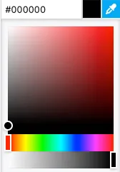
Each badge - the four priorities and the total - has its own background and text color. A hex value can be input in one of the formats:
#RRGGBB#RRGGBBAA#RGB#RGBA
Alternatively, the integrated color picker can be used to visually pick a color:
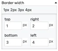
Border width - controls the width of the border on each side. Values can be manually input as:
<top>px <right>px <bottom>px <left>px<top_bottom>px <left_right>px<all>px
Alternatively, the built-in border editor can be used for a visual input:
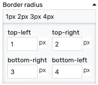
Border radius - border radius for the border corners. Values can be manually input as:
<top-left>px <top-right>px <bottom-left>px <bottom-right>px<left>px <right>px<all>px
Alternatively, the built-in border radius editor can be used for a visual input:
Padding - distance from the border to the inner contents in pixels.
Opacity - controls the transparency of the component.
Position
Section titled “Position”The position section contains properties which affect the position and size of the component. These can be changed by dragging and resizing the component with the mouse, or directly, by manually entering the values:
Left - distance from the left edge in pixels
Top - distance from the top edge in pixels
Width - component width in pixels
Height - component height in pixels
Typography
Section titled “Typography”Font size - the size of the text inside the component.