

Audible Alarm
Audible Alarm component
Section titled “Audible Alarm component”
The audible alarm makes alarms heard rather than seen. It plays a sound when an alarm becomes active, repeats it while one remains, and gives the operator a control to silence it.
Features
Section titled “Features”Configuration
Section titled “Configuration”Repeat interval - how often the sound repeats while an alarm stays active, in seconds. Set it to 0 to play once per alarm instead of repeating.
Duration - how long each sound plays, in seconds.
Critical sound, High sound, Medium sound, Low sound - the sound used for each priority. The highest active priority decides which one plays.
If no sound is set for a priority the component generates a tone instead, so it is audible before any files are configured. It also falls back to that tone when a configured file fails to play - a wrong URL makes the alarm sound different, never silent.
Silencing
Section titled “Silencing”Clicking the control toggles between the two states. Both labels can be changed:
Active label - shown while sound is enabled. The default is Sound On.
Silenced label - shown while muted. The default is Muted.
A mute does not last forever. When the last active alarm clears, the component un-mutes itself, so the next alarm is heard. It does this only on a real transition from some active alarms to none - a momentary gap in the feed will not revert a mute the operator has just applied.
Alarm filter
Section titled “Alarm filter”Every alarm component shares these three properties. They decide which alarms this component shows; they never change the alarms themselves. An empty value means “show all”.
Areas - show only alarms from these areas. Add one entry per area.
Category - show only alarms of this category. The options come from the connector’s own category table, so they cannot drift from the values the filter compares against.
Min priority - show only alarms at or above this priority.
Alarms are raised by the runtime, not by the HMI — see Alarming.
The style properties define the look of the component.
Active background, Active text and Active border - the colors used while sound is enabled.
Silenced background, Silenced text and Silenced border - the colors used while muted.
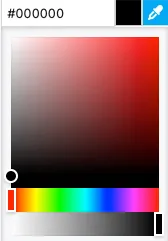
A hex value can be input in one of the formats:
#RRGGBB#RRGGBBAA#RGB#RGBA
Alternatively, the integrated color picker can be used to visually pick a color:
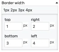
Border width - controls the width of the border on each side. Values can be manually input as:
<top>px <right>px <bottom>px <left>px<top_bottom>px <left_right>px<all>px
Alternatively, the built-in border editor can be used for a visual input:
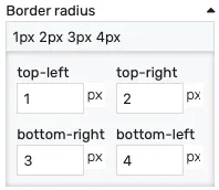
Border radius - border radius for the border corners. Values can be manually input as:
<top-left>px <top-right>px <bottom-left>px <bottom-right>px<left>px <right>px<all>px
Alternatively, the built-in border radius editor can be used for a visual input:
Padding - distance from the border to the inner contents in pixels.
Opacity - controls the transparency of the component.
Position
Section titled “Position”The position section contains properties which affect the position and size of the component. These can be changed by dragging and resizing the component with the mouse, or directly, by manually entering the values:
Left - distance from the left edge in pixels
Top - distance from the top edge in pixels
Width - component width in pixels
Height - component height in pixels
Typography
Section titled “Typography”Font size - the size of the text inside the component.